前言
本文主要记录的是一些css的特效,一些在日常开发中使用到的css效果,记录在此,方便日后用到的时候直接拿来使用。
当然,很多都是在网上看到的效果,自己根据效果实现的。也会有一些是抄的。不论怎样,目的只为学习。如侵犯了您的权益,请告知!必定立即删除。
1.按钮系列
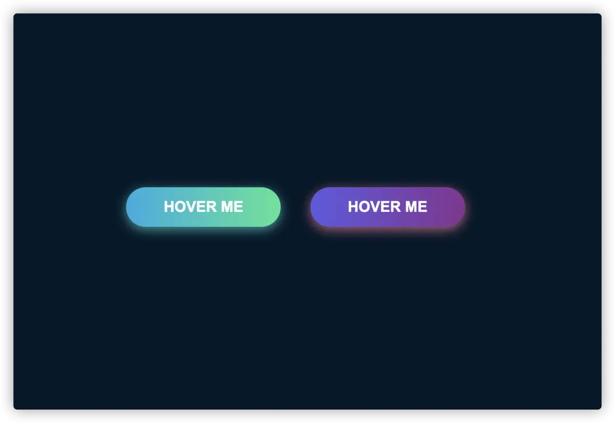
1.1、 霓虹特效
先看效果图
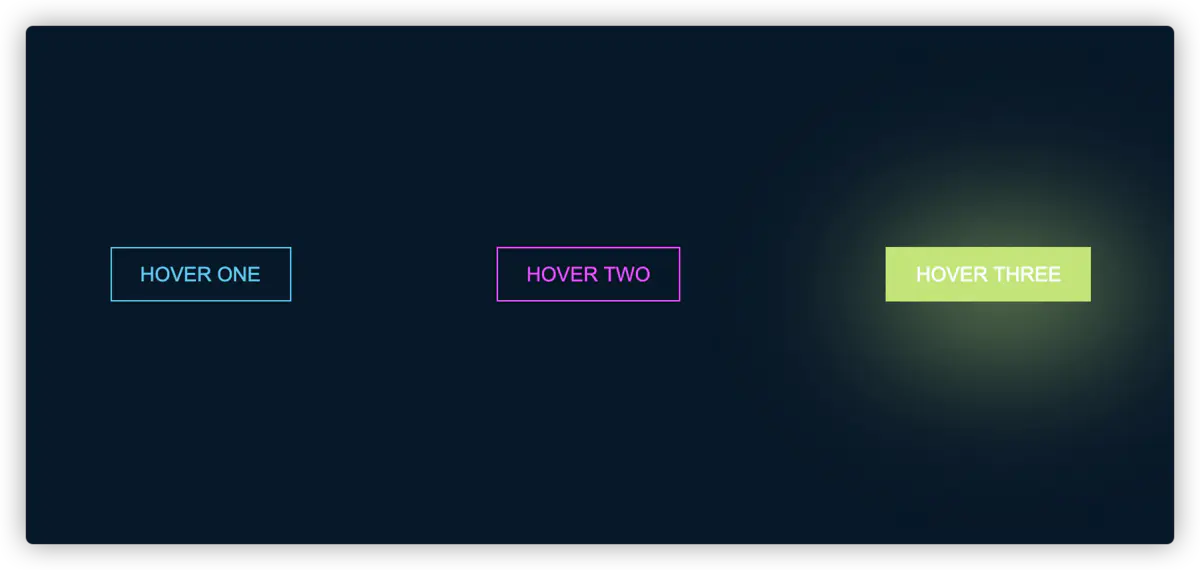
查看效果
颜色值
- 主题色:#031628
- 按钮一的颜色: #4cc9f0
- 按钮二的颜色: #f038ff
- 按钮三的颜色: #b9e769
Html 代码
1
2
3
4
5
| <div class="base-btn">
<button class="btn one">Hover one</button>
<button class="btn two">Hover two</button>
<button class="btn three">Hover three</button>
</div>
|
Css 代码
1
2
3
4
5
6
7
8
9
10
11
12
13
14
15
16
17
18
19
20
21
22
23
24
25
26
27
28
29
30
31
32
33
34
35
36
37
38
39
40
41
42
43
44
45
46
47
48
49
50
51
52
| .base-btn {
display: flex;
align-items: center;
justify-content: space-around;
height: 100vh;
background: #031628;
}
.btn {
border: 1px solid;
background-color: transparent;
text-transform: uppercase;
font-size: 14px;
padding: 10px 20px;
font-weight: 300;
}
.one {
color: #4cc9f0;
}
.one:hover {
color: white;
border-color: #4cc9f0;
background-color: #4cc9f0;
-webkit-box-shadow: 10px 10px 99px 6px rgba(76, 201, 240, 1);
-moz-box-shadow: 10px 10px 99px 6px rgba(76, 201, 240, 1);
box-shadow: 10px 10px 99px 6px rgba(76, 201, 240, 1);
}
.two {
color: #f038ff;
}
.two:hover {
color: white;
border-color: #f038ff;
background-color: #f038ff;
-webkit-box-shadow: 10px 10px 99px 6px rgba(240, 56, 255, 1);
-moz-box-shadow: 10px 10px 99px 6px rgba(240, 56, 255, 1);
box-shadow: 10px 10px 99px 6px rgba(240, 56, 255, 1);
}
.three {
color: #b9e769;
}
.three:hover {
color: white;
border-color: #b9e769;
background-color: #b9e769;
-webkit-box-shadow: 10px 10px 99px 6px rgba(185, 231, 105, 1);
-moz-box-shadow: 10px 10px 99px 6px rgba(185, 231, 105, 1);
box-shadow: 10px 10px 99px 6px rgba(185, 231, 105, 1);
}
|
1.2、 跑马灯边框
由于本人暂时不会制作gif图,所以只能先使用静态图
效果图
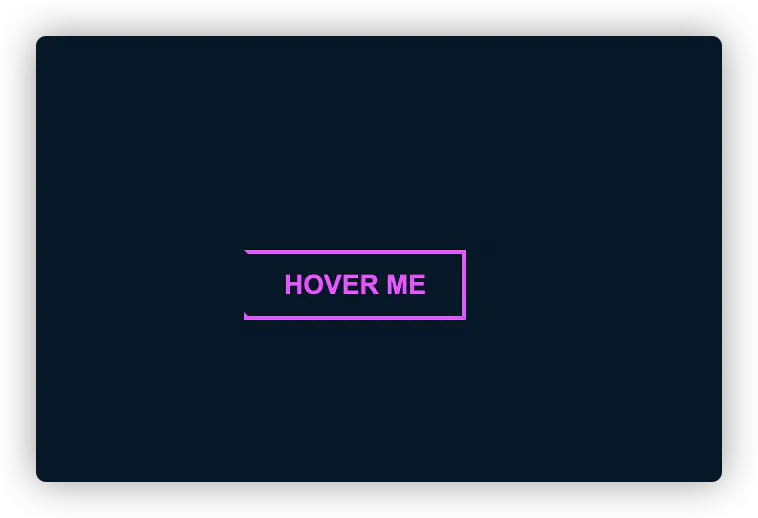
CodePen查看效果
Html 代码
1
2
3
| <div id="container">
<button>Hover me</button>
</div>
|
Css 代码
1
2
3
4
5
6
7
8
9
10
11
12
13
14
15
16
17
18
19
20
21
22
23
24
25
26
27
28
29
30
31
32
33
34
35
36
37
38
39
40
41
42
43
44
45
46
47
48
49
50
51
52
53
54
55
56
57
58
| #container {
display: flex;
align-items: center;
justify-content: center;
height: 100vh;
background-color: #031628;
}
button {
border: 0;
background: none;
text-transform: uppercase;
color: #f038ff;
font-weight: bold;
position: relative;
outline: none;
padding: 10px 20px;
box-sizing: border-box;
}
button::before,
button::after {
box-sizing: inherit;
position: absolute;
content: "";
border: 2px solid transparent;
width: 0;
height: 0;
}
button::after {
bottom: 0;
right: 0;
}
button::before {
top: 0;
left: 0;
}
button:hover::before,
button:hover::after {
width: 100%;
height: 100%;
}
button:hover::before {
border-top-color: #f038ff;
border-right-color: #f038ff;
transition: width 0.3s ease-out, height 0.3s ease-out 0.3s;
}
button:hover::after {
border-bottom-color: #f038ff;
border-left-color: #f038ff;
transition: border-color 0s ease-out 0.6s, width 0.3s ease-out 0.6s,
height 0.3s ease-out 1s;
}
|
1.3、 圆角过度
效果图
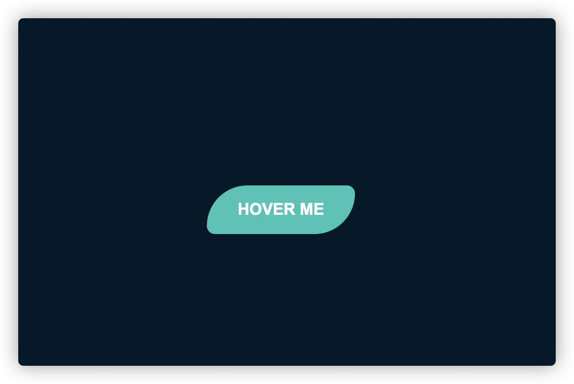
查看效果
Html 代码
1
2
3
4
5
6
7
8
9
10
11
12
13
| <!DOCTYPE html>
<html lang="en">
<head>
<meta charset="UTF-8" />
<meta name="viewport" content="width=device-width, initial-scale=1.0" />
<title>圆角变换</title>
</head>
<body>
<div class="border-btn">
<button>Hover me</button>
</div>
</body>
</html>
|
Css 代码
1
2
3
4
5
6
7
8
9
10
11
12
13
14
15
16
17
18
19
20
21
22
23
24
25
26
27
28
29
| .border-btn {
display: flex;
align-items: center;
justify-content: center;
height: 100vh;
background-color: #031628;
}
button {
border: 0;
border-radius: 10px;
background: #2ec4b6;
text-transform: uppercase;
color: white;
font-size: 16px;
font-weight: bold;
padding: 15px 30px;
outline: none;
position: relative;
transition: border-radius 3s;
-webkit-transition: border-radius 3s;
}
button:hover {
border-bottom-right-radius: 50px;
border-top-left-radius: 50px;
border-bottom-left-radius: 10px;
border-top-right-radius: 10px;
}
|
1.4、 冰冻特效
效果图
查看效果
Html 代码
1
2
3
4
| <div class="frozen-btn">
<button class="green">Hover me</button>
<button class="purple">Hover me</button>
</div>
|
Css 代码
1
2
3
4
5
6
7
8
9
10
11
12
13
14
15
16
17
18
19
20
21
22
23
24
25
26
27
28
29
30
31
32
33
34
35
36
37
38
39
40
41
42
43
44
45
46
47
48
49
50
51
52
53
54
55
56
57
58
59
60
| .frozen-btn {
display: flex;
align-items: center;
justify-content: center;
height: 100vh;
background-color: #031628;
}
button {
border: 0;
margin: 20px;
text-transform: uppercase;
font-size: 20px;
font-weight: bold;
padding: 15px 50px;
border-radius: 50px;
color: white;
outline: none;
position: relative;
}
button:before {
content: "";
display: block;
background: linear-gradient(
to left,
rgba(255, 255, 255, 0) 50%,
rgba(255, 255, 255, 0.4) 50%
);
background-size: 210% 100%;
background-position: right bottom;
height: 100%;
width: 100%;
position: absolute;
top: 0;
bottom: 0;
right: 0;
left: 0;
border-radius: 50px;
transition: all 1s;
-webkit-transition: all 1s;
}
.green {
background-image: linear-gradient(to right, #25aae1, #40e495);
box-shadow: 0 4px 15px 0 rgba(49, 196, 190, 0.75);
}
.purple {
background-image: linear-gradient(to right, #6253e1, #852d91);
box-shadow: 0 4px 15px 0 rgba(236, 116, 149, 0.75);
}
.purple:hover:before {
background-position: left bottom;
}
.green:hover:before {
background-position: left bottom;
}
|
1.5、 闪电特效
效果图
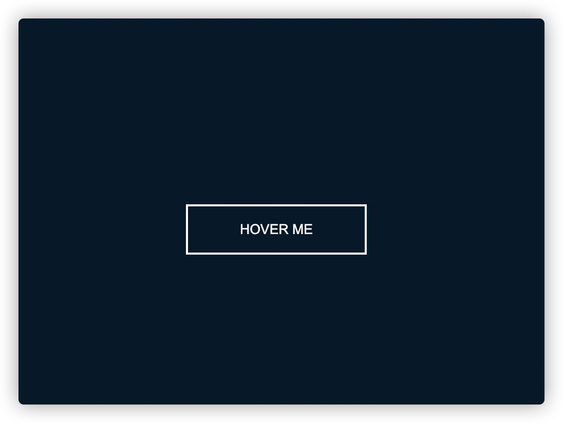
查看效果
Html 代码
1
2
3
4
5
6
7
8
9
10
11
12
13
| <!DOCTYPE html>
<html lang="en">
<head>
<meta charset="UTF-8" />
<meta name="viewport" content="width=device-width, initial-scale=1.0" />
<title>按钮闪电特效</title>
</head>
<body>
<div class="shiny-shadow">
<button><span>Hover me</span></button>
</div>
</body>
</html>
|
Css 代码
1
2
3
4
5
6
7
8
9
10
11
12
13
14
15
16
17
18
19
20
21
22
23
24
25
26
27
28
29
30
31
32
33
34
35
36
37
38
39
40
41
| .shiny-shadow {
display: flex;
align-items: center;
justify-content: center;
height: 100vh;
background-color: #031628;
}
button {
border: 2px solid white;
background: transparent;
text-transform: uppercase;
color: white;
padding: 15px 50px;
outline: none;
overflow: hidden;
position: relative;
}
span {
z-index: 20;
}
button:after {
content: "";
display: block;
position: absolute;
top: -36px;
left: -100px;
background: white;
width: 50px;
height: 125px;
opacity: 20%;
transform: rotate(-45deg);
}
button:hover:after {
left: 120%;
transition: all 600ms cubic-bezier(0.3, 1, 0.2, 1);
-webkit-transition: all 600ms cubic-bezier(0.3, 1, 0.2, 1);
}
|
1.6、 加载特效
效果图
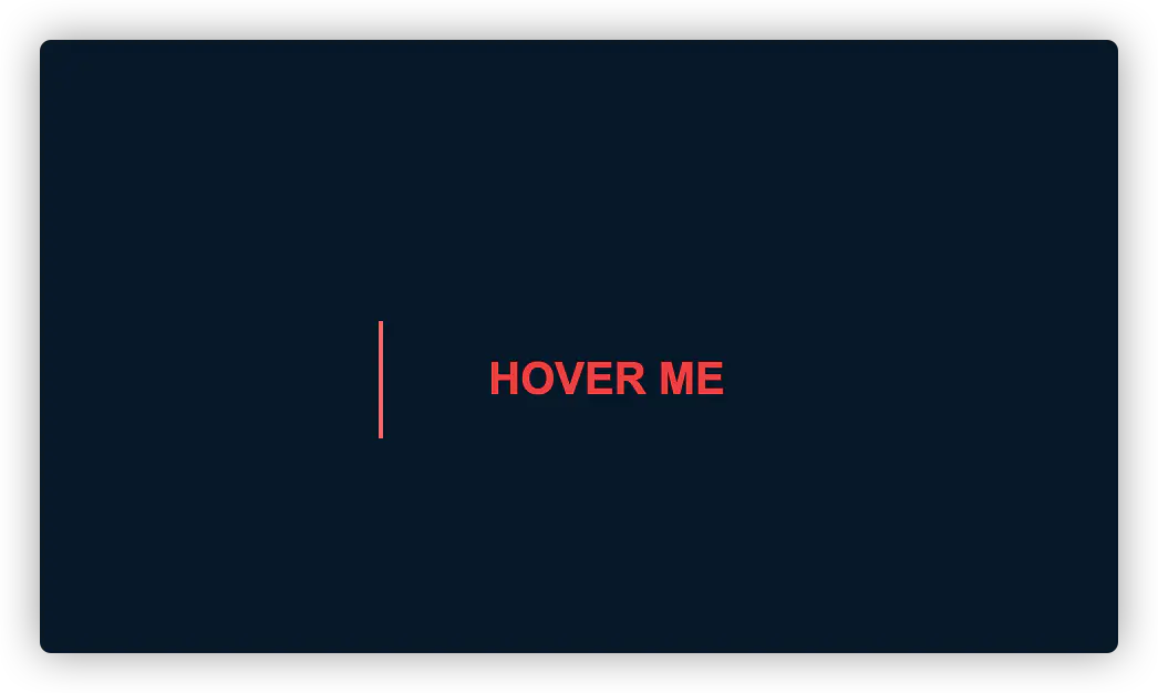
查看效果
Html 代码
1
2
3
4
5
6
7
8
9
10
11
12
13
| <!DOCTYPE html>
<html lang="en">
<head>
<meta charset="UTF-8">
<meta name="viewport" content="width=device-width, initial-scale=1.0">
<title>加载特效</title>
</head>
<body>
<div class="loading-btn">
<button><span>Hover me</span></button>
</div>
</body>
</html>
|
Css 代码
1
2
3
4
5
6
7
8
9
10
11
12
13
14
15
16
17
18
19
20
21
22
23
24
25
26
27
28
29
30
31
32
33
34
35
36
37
38
39
40
41
| .loading-btn {
display: flex;
align-items: center;
justify-content: center;
height: 100vh;
background-color: #031628;
}
button {
background: transparent;
border: 0;
border-radius: 0;
text-transform: uppercase;
font-weight: bold;
font-size: 20px;
padding: 15px 50px;
position: relative;
}
button:before {
transition: all 0.8s cubic-bezier(0.7, -0.5, 0.2, 2);
content: '';
width: 1%;
height: 100%;
background: #ff5964;
position: absolute;
top: 0;
left: 0;
}
button span {
color:#ff0036;
}
button:hover:before {
background: #ff5964;
width: 100%;
}
button:hover span {
mix-blend-mode: darken;
}
|
[原文链接](blog.duomly.com/html-button-hover-effects/)
华丽的分割线
2、卡片系列
2.1、经典卡片
效果图
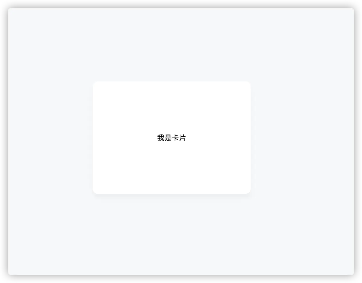
查看效果
Html 代码
1
2
3
4
5
| <div class="container">
<div class="card">
我是卡片
</div>
</div>
|
Css 代码
1
2
3
4
5
6
7
8
9
10
11
12
13
14
15
16
17
18
19
| .container {
display: flex;
justify-content: center;
align-items: center;
width: 100%;
height: 100vh;
background-color: #f7f8fa;
}
.card {
display: flex;
justify-content: center;
align-items: center;
padding: 24px;
background-color: #fff;
border-radius: 12px;
box-shadow: 0 8px 12px #ebedf0;
width: 300px;
height: 200px;
}
|
如果能够帮助到你,是小编最大的荣幸
当然 有 不好的地方 请大家帮忙指出 学习永无止境
小编一直认为 人外有人 天外有天 一起学习 共同进步
让我们共同加油吧!!
版权声明: 转载请留言,未经许可禁止转载,转载时请注明出处(必须保留作者署名及链接)